
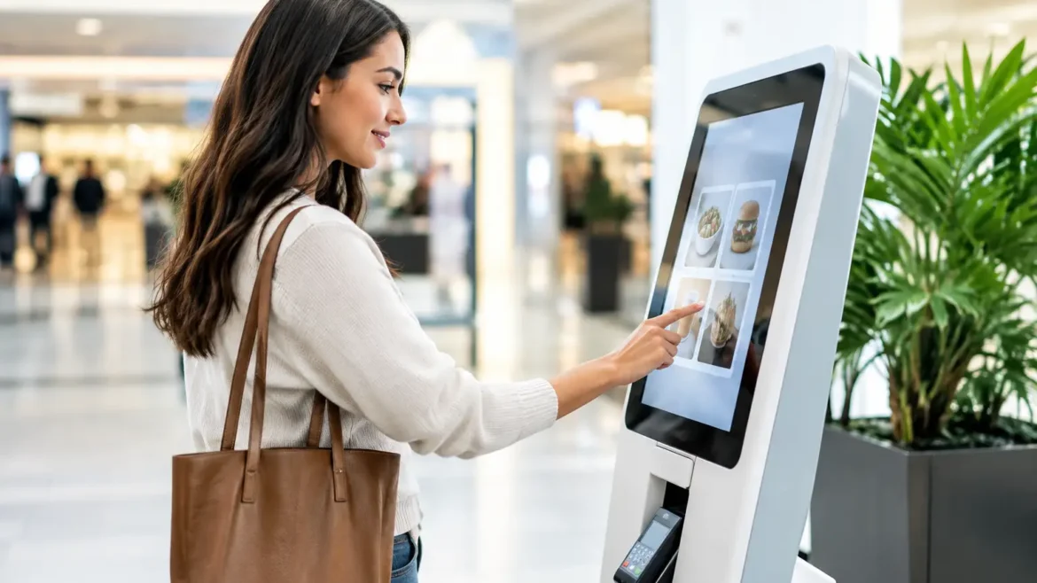
A mall kiosk can receive thousands of passing glances before lunch, yet kiosk conversion results are often decided in the first three seconds. Can a shopper understand the offer from the aisle? Can they see the product, price point, and next step without stopping to ask? If the answer is no, even a premium mall location can underperform.
For retail operators, a kiosk is not simply a compact shop. It is a high-visibility sales environment working under tight space, staffing, and rental constraints. The right custom-built unit turns passing foot traffic into product interaction, meaningful conversations, and transactions. The wrong one becomes an expensive obstacle that people walk around.
What Strong Kiosk Conversion Results Actually Mean
Conversion is usually discussed as a percentage: the number of customers who buy divided by the number who engage or enter the selling area. That metric matters, but it does not tell the whole story. A kiosk selling high-consideration products may convert fewer visitors while generating a stronger average order value. A quick-service concept may depend on rapid, repeatable transactions during peak hours.
The right performance measure depends on the business model. A beauty kiosk may track consultations that become purchases, samples issued, and repeat visits. A mobile accessories operator may focus on transaction volume, attachment sales, and queue time. A specialty food kiosk may measure tasting-to-purchase rate and the number of orders completed per hour.
The goal is not to force every business into the same benchmark. It is to create a space that supports the specific customer action that produces revenue. Before design begins, define what conversion means for the kiosk and how the team will measure it after opening.
Design the First Five Seconds
Most kiosk sales are won or lost before a customer reaches the counter. Shoppers should be able to identify the brand category, main product, and price range from several meters away. If they need to circle the unit to understand what is being sold, the layout is adding friction.
A clear visual hierarchy starts with one primary message. This could be a hero product, a limited-time offer, a service promise, or a visible product demonstration. Trying to show every SKU, campaign message, and social media graphic at once creates visual noise. In a busy mall, clarity earns attention.
Lighting also affects the quality of that first impression. Product lighting should reveal texture, color, and detail, especially for cosmetics, jewelry, food, electronics, and premium gift items. General ambient lighting may illuminate the kiosk, but targeted lighting makes the merchandise feel intentional and easier to assess.
Branding needs to work at two distances. From the aisle, it must communicate the name and category quickly. At the counter, it should reinforce quality through materials, detailing, screen content, packaging displays, and staff presentation. A kiosk should look as polished at arm’s length as it does from across the corridor.
Avoid the Glass-Box Problem
Some kiosks are designed like miniature stores with products enclosed behind glass on every side. Security is necessary, but excessive barriers can make a unit feel difficult to enter or interact with. Customers may admire products without feeling invited to touch, test, or ask questions.
The balance depends on the product. High-value items may require secure showcases, while lower-value accessories can benefit from open display zones. A good design separates products that need protection from products that should encourage handling. It gives staff control without turning every conversation into a request to unlock a cabinet.
Build the Customer Journey Into the Footprint
A kiosk footprint is limited, which makes circulation a commercial decision rather than a decorative one. The counter position, product wall, payment point, storage access, and staff movement all affect how quickly a customer can move from interest to purchase.
Start by mapping the approach. Which direction does the dominant traffic flow come from? Where are nearby anchors, escalators, entrances, and competing retail units? A kiosk placed in a central concourse may receive traffic from multiple sides, but not all sides deserve identical treatment. The strongest selling face should address the busiest approach route.
Next, create a natural engagement zone. This is where a shopper can pause without blocking the walkway or feeling exposed. Demonstration counters, testers, featured products, and clear menu boards work well here. The payment area should be easy to locate but should not dominate the entire frontage. Customers need a reason to stop before they are asked to buy.
Staff workflow is equally important. When employees must cross paths, reach over merchandise, or leave the counter to access packaging, service slows down. In high-traffic periods, those lost seconds become abandoned purchases. In-house fabrication allows the operational details to be planned into the build, including concealed storage, cable routes, equipment housing, and access panels.
Product Display Should Make Buying Easier
A common mistake is treating every product equally. Customers do not need to see everything at once. They need help finding the most relevant item quickly.
Use display levels to guide attention. Hero products belong at eye level or in the most visible illuminated area. Supporting products can sit nearby in organized groups. Add-on items should be positioned where they can support a natural upsell, such as near the payment point or beside the core product category.
Price clarity is especially important in kiosks. Many people hesitate to engage because they do not want to begin a conversation they cannot afford. Visible starting prices, offer bundles, or simple category signage can remove that hesitation. This does not mean every item needs a large price tag. It means the shopper should understand whether the brand is accessible, premium, or somewhere in between.
Digital screens can support product storytelling, but they should earn their space. Fast-moving visuals may catch attention, while a simple loop can explain benefits, show product use, or highlight a promotion. A screen that competes with the product or forces staff to repeat basic information is not doing its job.
Use Materials That Support the Brand and the Reality of Retail
Material selection affects both perceived value and operating cost. Gloss finishes, metal details, acrylic, timber textures, LED features, and printed graphics can all create a distinctive presence. But mall kiosks experience daily contact, cleaning, bag impacts, product spills, and constant use by staff. A visually dramatic finish that scratches easily can lose its impact quickly.
The best choice is usually a considered mix: durable surfaces in high-contact areas, premium finishes where customers look closely, and replaceable graphic panels where campaigns may change. This approach protects the investment while keeping the kiosk adaptable.
It also pays to plan for maintenance from day one. Hidden storage doors should open cleanly. Lightboxes should allow practical access. Counter edges should handle repeated use. Electrical components should be positioned safely and logically. These are build details that customers may never notice directly, but they shape the daily experience of the sales team.
Measure, Adjust, and Improve After Opening
A kiosk launch is the start of the optimization process, not the end. Track foot traffic estimates by time of day, the number of customer interactions, transactions, average basket value, and busy-period wait times. If possible, compare results before and after a layout adjustment, new display feature, or campaign change.
Watch customer behavior as closely as sales data. Where do people stop? Which display gets touched? Are shoppers looking for prices? Do they approach from one side but leave before speaking to staff? These observations can reveal problems that a spreadsheet will not show.
Not every issue requires a full rebuild. A new hero graphic, revised shelf arrangement, improved lighting angle, clearer offer communication, or a better queue position can improve performance. However, if the footprint fundamentally blocks traffic flow or gives staff no workable service area, cosmetic changes will have limited impact. That is why early planning matters.
Choosing a Partner That Builds for Sales
Kiosk conversion results improve when design, fabrication, and on-site installation are coordinated around the same commercial objective. A concept can look impressive in a presentation and still fail when product quantities, mall regulations, electrical needs, security requirements, and staff movement are not resolved before manufacturing.
For operators in Dubai and across the UAE, Creative Roots brings kiosk design, in-house fabrication, branding, and installation into one turnkey project process. That coordination helps teams make practical decisions early, from the counter height and storage volume to display lighting and branded finishes.
The strongest kiosk is not the one with the most features. It is the one that makes the next customer action obvious, easy, and worth taking. Start with the behavior you need to create, then build every visible and hidden detail around it.