
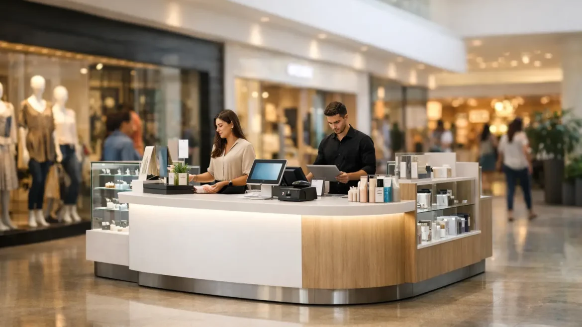
A mall kiosk has only a few seconds to earn attention from people who were not planning to stop. That is what makes designing a mall kiosk different from designing a full retail store. Every visible surface, product position, light source, and customer touchpoint has to work harder within a smaller footprint.
For retail operators, brand managers, and property-focused businesses, the objective is not simply to build an attractive unit. It is to create a compact retail environment that is easy to notice, easy to shop, practical for staff, and built to meet the operating requirements of a high-traffic mall. The strongest kiosks turn passing foot traffic into a clear next action: browse, test, ask, buy, or book.
Start With the Commercial Job of the Kiosk
Before selecting finishes or drawing a counter, define what the kiosk needs to accomplish. A perfume sampling bar, mobile accessories kiosk, coffee counter, beauty activation, and jewelry display may share a mall location, but they require very different layouts and service flows.
The first question is simple: what should a customer be able to understand from three to five meters away? That answer should guide the exterior branding, product category cues, and the focal point of the unit. If a customer has to walk right up to work out what is being sold, the kiosk is already losing valuable attention.
Then consider the transaction model. A kiosk designed for quick purchases needs a direct path from display to payment. A service-led kiosk, such as a telecom or travel operator, needs room for conversation, digital screens, and possibly seated consultations. A food or beverage kiosk needs a disciplined back-of-house workflow that separates ordering, preparation, collection, cleaning, and stock replenishment.
This early planning also prevents a common mistake: treating every side of the kiosk as identical. In many mall locations, one face receives most of the traffic while another faces a wall, escalator, or lower-volume corridor. Invest display space and visual hierarchy where the audience will actually see it.
Designing a Mall Kiosk Around Customer Flow
A kiosk is viewed from all directions, often while customers are moving quickly. Its layout must invite approach without creating congestion around the sales counter. Wide, clear openings and reachable displays generally perform better than a perimeter packed with tall cabinets.
Create a clear approach and stopping point
The leading edge of the kiosk should communicate one strong message. This may be a hero product, a live demonstration area, a signature graphic, or a clear offer. Trying to show the entire range from every angle can make the unit feel cluttered and difficult to read.
A practical design gives customers a natural place to pause without blocking people walking through the mall. For example, a product trial ledge or low display table can encourage interaction before a customer reaches the point of sale. This works especially well for cosmetics, consumer electronics, fragrance, and gifting concepts.
Counter height matters. A high counter can create useful separation for payment equipment and staff operations, but too much height puts a visual barrier between the product and the customer. Lower display zones create openness, while a carefully positioned service counter protects the transaction process.
Build for staff movement, not just customer views
The kiosk may look simple from the outside, but its daily operation is rarely simple. Staff need accessible storage, a secure cash or POS location, cable management, room for packaging, and a place for personal items that does not spill into the retail area.
Designers should map staff movement during busy periods. Can one team member serve a customer while another replenishes stock? Is there enough room to open drawers without blocking the aisle? Can cleaning supplies, bags, and spare inventory be stored out of sight? These small details determine whether a kiosk remains polished after its first week of trading.
Make Branding Visible Without Overbuilding
Mall kiosks compete with storefronts, digital advertising, atriums, and neighboring activations. Strong branding is necessary, but oversized logos and too many visual messages can make a small unit appear heavier than it is.
Use a simple visual hierarchy. The brand name should be visible at a distance. The product or service category should be apparent at a closer range. Offers, product benefits, and price communication should be available once a customer has stopped. Each layer has a different job.
Materials can reinforce positioning without relying on graphics alone. Matte laminates, powder-coated metal, timber finishes, acrylic, fluted panels, illuminated fabric, and laser-cut details all create different perceptions. A premium skincare brand may favor soft light, refined edges, and restrained color. A tech accessories retailer may need brighter illumination, durable display fixtures, and bolder product communication.
The trade-off is maintenance. Highly reflective finishes show fingerprints. Open shelves create visual interest but demand frequent merchandising. Pale surfaces can look premium, but they may need more cleaning in a busy public environment. Material selection should match the staffing level and operating reality of the brand.
Plan Lighting, Power, and Technology Early
Lighting is one of the fastest ways to improve product visibility, yet it is often left until late in the build. General mall lighting is rarely enough to make small products, display graphics, or a brand color palette stand out.
Use layered lighting rather than placing bright LED strips everywhere. Ambient lighting defines the kiosk form, focused lighting supports products, and feature lighting draws attention to a hero area. The goal is a controlled, inviting environment, not glare on glossy packaging or screens.
Power planning should begin alongside the layout. POS terminals, charging points, digital menus, LED signage, refrigeration, display screens, and product demonstrators all need organized connections. Concealed cable routes and service access panels keep the kiosk clean and make maintenance easier after installation.
For technology-led concepts, avoid adding screens simply because they are available. A digital screen should have a clear role: showing product demonstrations, rotating offers, collecting leads, or reducing the workload on staff. If the content will not be updated regularly, a high-quality static graphic may be the smarter investment.
Design Within Mall Requirements From Day One
Mall management and local authorities typically have clear expectations around kiosk dimensions, fire safety, electrical load, materials, access, signage, and installation timing. These requirements can influence the design substantially, especially in premium retail destinations or locations with strict fit-out manuals.
A concept that ignores approval requirements may look impressive in a presentation but become expensive to revise. This is why design, fabrication, and site coordination should work as one process. The team needs to understand the location’s permitted height, sightline restrictions, floor protection rules, delivery access, working hours, and technical submission requirements before manufacturing starts.
Durability is another approval-adjacent issue. A mall kiosk is exposed to constant public contact, cleaning, trolley movement, and repeated opening of doors and drawers. The build needs commercial-grade hardware, stable internal framing, protected edges, and finishes that can withstand daily use. Lightweight construction may help with transport and installation, but it cannot come at the cost of stability or safety.
Use Storage as a Design Advantage
Insufficient storage is one of the most damaging kiosk design failures. When extra stock, cartons, cables, bags, and cleaning products have nowhere to go, they quickly appear on counters or around staff feet. The customer sees disorder, even if the product display itself is well designed.
Integrate storage into plinths, back counters, locked cabinets, and concealed compartments. Prioritize the items staff use most often, then allocate deeper storage for reserve stock. If the kiosk sells many sizes, colors, or small SKUs, stock organization should be part of the joinery plan rather than an afterthought.
For compact footprints, custom-built joinery can make a meaningful difference. A well-designed drawer system may hold more usable inventory than a generic cabinet while keeping the exterior clean. Creative Roots approaches kiosk manufacturing with this practical balance in mind: visual impact on the customer-facing side and efficient working space behind it.
Prototype the Experience Before Fabrication
A 3D render is valuable, but it cannot fully reveal whether the kiosk works for a real employee or shopper. Before final fabrication, review the design from eye level and test key dimensions. Check the reach to products, sightlines to branding, working clearance behind counters, and access to storage doors.
Ask practical questions. Can a customer in a wheelchair engage comfortably with the display or counter? Is the main logo visible above nearby visual noise? Will a staff member be able to restock during peak traffic? Does the kiosk still look organized when it is carrying a full day of inventory?
This review stage is where a turnkey contractor adds real value. When design teams work closely with in-house fabrication and installation crews, potential build problems can be resolved before materials are ordered and site time is booked.
A successful kiosk does not need to be the largest object in the mall. It needs to make the right customer feel that stopping is worth their time, then give staff the tools to deliver a smooth sale. Start with that commercial moment, and let every design decision support it.