
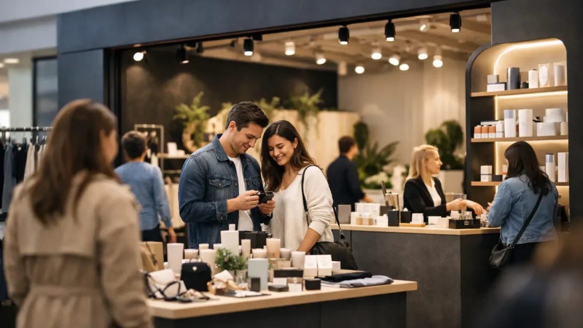
A pop-up has only a few seconds to earn attention. In a busy mall, exhibition hall, hotel lobby, or outdoor activation, shoppers decide quickly whether a space feels relevant, credible, and worth entering. Effective branded pop up shop design turns that split-second decision into a clear commercial advantage by combining visual impact, practical customer flow, and a build that performs in a live environment.
For retail operators and marketing teams, the objective is not simply to create a photogenic structure. The pop-up must express the brand, showcase products properly, support staff, handle high footfall, and make it easy for visitors to buy, inquire, sample, or share. That requires design and execution to work together from the first brief.
Start With the Commercial Job of the Pop-Up
Before selecting finishes, colors, or furniture, define what the pop-up must achieve. A product launch needs discovery and demonstration space. A seasonal retail activation may prioritize stock capacity and fast transactions. A lead-generation installation needs a visible welcome point, a simple visitor journey, and room for meaningful conversations.
The strongest briefs identify one primary action. Should visitors purchase a product, book a consultation, try a sample, scan a code, or register for an event? When every element is designed around that action, the space feels focused rather than crowded.
This is especially relevant in Dubai and across the UAE, where premium retail locations and major events bring high expectations for finish quality. A striking concept that cannot handle daily use, venue rules, electrical requirements, or tight installation windows is not a complete solution. The build needs to be market-ready.
Build a Brand Story Shoppers Can Read Quickly
A pop-up is a physical advertisement, but it should not feel like a wall of graphics. Shoppers need to understand the offer at a glance, then find reasons to stay. The best approach is a hierarchy: a clear brand identifier visible from a distance, a concise product message at the entry, and details that reward closer inspection.
Brand colors, typography, material choices, lighting, and product display should all point in the same direction. A skincare brand may need calm, clean surfaces and flattering mirror lighting. A technology brand may benefit from crisp lines, integrated screens, and controlled product demonstrations. A food or beverage activation might use warm materials, scent, sampling counters, and open sightlines to create energy.
The key is restraint. Applying a logo to every available surface rarely increases recall. Instead, use branded moments where they matter most: the fascia, feature wall, service counter, packaging zone, and a photo-friendly focal point. This lets the environment feel premium while still being unmistakably yours.
Design for the View From Every Direction
Pop-ups are often placed in open atriums, mall corridors, exhibition aisles, and public venues where customers approach from multiple sides. A front-only design can leave valuable visibility unused.
Plan the exterior elevations as carefully as the main entrance. High-level signage should be readable across the space, while lower-level messaging should help customers understand what is available as they get closer. If the footprint is compact, a strong overhead element, illuminated logo, or distinctive architectural frame can give the unit a much larger presence without consuming extra floor area.
Create a Customer Journey, Not a Display Maze
Good branded pop up shop design guides visitors naturally. It does not force them to guess where to stand, where to browse, or how to pay. The layout should create a simple sequence: attract, enter, explore, engage, and convert.
The entry needs to stay open and inviting. Avoid placing large counters or dense product fixtures directly in the approach path unless the format is specifically designed for quick service. Once inside, hero products should be easy to spot, with supporting products organized in a way that makes comparison simple.
For a small footprint, every zone must earn its place. A demo counter can double as a consultation point. Under-counter storage can reduce the need for back-of-house walls. Digital screens can carry campaign content that would otherwise require several printed panels. The right multi-purpose features protect the customer experience without making the unit feel overdesigned.
Staff movement matters just as much as visitor movement. Team members need clear access to stock, payment devices, cables, refreshments, and cleaning supplies without constantly crossing the customer path. When operational details are ignored, even an impressive retail concept can become slow and difficult to manage during peak hours.
Use Materials That Match the Activation
Temporary does not have to look temporary. The material strategy should reflect the duration, location, budget, and desired brand position. For a weekend activation, lightweight modular structures and printed graphic skins may be the sensible choice. For a multi-month mall campaign, durable joinery, solid-surface counters, engineered storage, and integrated lighting can offer a better return.
There is always a trade-off. Highly customized forms and premium finishes can make the pop-up more memorable, but they may increase fabrication time, transport complexity, and cost. Modular systems are faster to install and easier to reuse, though they can look generic if the branding and detailing are weak.
A practical solution often combines both. Use a reusable structural base for efficiency, then add bespoke brand elements such as laser-cut panels, illuminated signage, custom counters, textured cladding, or product-specific display units. This gives the activation a custom-built feel while preserving value for future campaigns.
Lighting Is a Sales Tool
Lighting affects how products look, how long visitors stay, and how visible the pop-up is from a distance. General lighting creates comfort, but feature lighting creates focus. Product shelves, hero displays, mirrors, graphics, and transaction areas all benefit from a deliberate lighting plan.
Choose light temperature based on the product and brand character. Warm light may suit lifestyle, beauty, and hospitality concepts, while a cooler, cleaner tone can work well for technology or contemporary retail. Avoid glare on screens, glossy packaging, and counters. It can make a premium display feel less polished and discourage product interaction.
Plan the Technical Details Before Fabrication
The best ideas are resolved before materials are cut. Site dimensions, ceiling height, access routes, venue approvals, load-in times, electrical points, fire safety requirements, and storage needs all affect the final design.
For example, a large illuminated feature may look excellent in a rendering but require a different structure if the venue limits height or power load. A kiosk with screens, refrigeration, or charging points needs cable routes and ventilation planned early. A pop-up positioned on a busy mall route may need stronger edge protection and more durable flooring than one placed in a controlled exhibition space.
This is where an end-to-end contractor provides real value. Design, in-house fabrication, branding, logistics, and on-site installation should be coordinated as one delivery process. Creative Roots approaches custom retail environments this way, helping brands move from a clear commercial brief to a finished, install-ready space without splitting responsibility across multiple suppliers.
Make the Pop-Up Easy to Measure
A successful activation should produce more than positive comments. Decide how performance will be measured before opening day. Sales are an obvious metric, but they are not the only one. Footfall, dwell time, product trials, qualified leads, social content created, QR scans, email sign-ups, and repeat visits can reveal whether the space is doing its job.
Design can make measurement easier. A dedicated consultation point helps staff record qualified conversations. A branded screen or digital form can capture registrations. A product-testing zone can track samples distributed. Even a distinct photo area can help quantify user-generated content when paired with a clear campaign prompt.
Do not overload the experience with data capture. If visitors need to complete several steps before receiving a sample or speaking with staff, many will walk away. Ask for the information that genuinely supports follow-up, then make the exchange feel worthwhile.
Treat Installation Day as Part of the Design
The final impression depends on what happens on site. Graphics must align cleanly, lighting must be tested, counters must sit level, product displays must be dressed, and every branded element must be checked from the customer viewpoint. A well-managed installation also leaves time for last-minute venue adjustments, which are common in live commercial locations.
Schedule a pre-opening walkthrough with the team who will operate the pop-up. They can identify practical issues that are easy to solve before doors open, such as insufficient storage, awkward queue positions, missing charging points, or a sign blocked by a neighboring unit. This is not a minor finishing step. It protects the investment made in the entire activation.
A well-built pop-up gives a brand a temporary address with permanent impact. Focus on the action you want visitors to take, make the experience easy to navigate, and insist on fabrication and installation that match the quality of the concept. The result is a space people notice, remember, and have a reason to enter.