
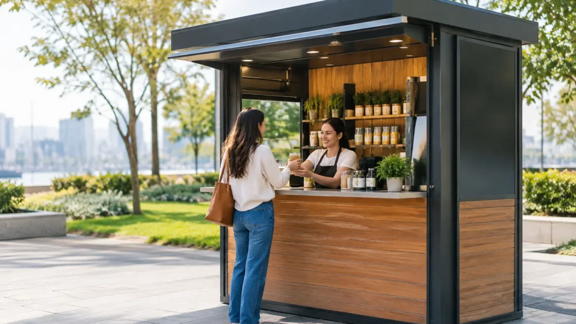
A busy outdoor kiosk has seconds to earn attention. A passerby should be able to identify the brand, understand the offer, and see where to order before foot traffic moves on. That is the real challenge of how to brand outdoor kiosks: creating a sharp visual identity that still performs under sun, dust, rain, heat, cleaning, and constant customer contact.
A logo applied to a counter is not a branded kiosk. The strongest units turn every visible surface – fascia, canopy, menu board, product display, lighting, and service counter – into one clear retail experience. They are designed to be noticed from a distance and built to work at close range.
Start With the Customer’s Viewing Journey
Outdoor branding should follow the way people actually approach the kiosk. From across a walkway, customers see the roofline, upper signage, color blocks, and lighting. At a few steps away, they should recognize the category, promotion, or product. At the counter, they need practical information: price, ordering instructions, payment options, and pickup direction.
This means the brand hierarchy must be intentional. Your business name or logo should be the first visual cue. The second should explain what you sell or why someone should stop. A coffee kiosk may lead with its name and a simple cue such as specialty coffee. A mobile accessories kiosk may use a concise promise around repairs, cases, or same-day service.
Trying to communicate every product, slogan, social channel, and promotion at once weakens the effect. Use the largest surfaces for recognition and the smaller customer-facing panels for details. If a message cannot be read at walking speed, it is not doing its job.
How to Brand Outdoor Kiosks for Visibility
Visibility is not only about making signage bigger. It is about contrast, placement, and sightlines. Before approving a design, assess where the unit will sit, what direction customers will approach from, and what visual competition surrounds it. A kiosk beside a busy road, promenade, beach venue, or outdoor mall needs a different signage strategy from one positioned in a sheltered courtyard.
Build a recognizable silhouette
The shape of the kiosk can carry as much brand value as graphics. A custom canopy edge, framed sign tower, curved counter, patterned screen, or illuminated header can make the unit recognizable from a distance. These architectural features are especially valuable when the kiosk operates in a crowded activation or retail zone where flat signage blends into the background.
The form should support operations, not create obstacles. Tall sign structures must be engineered for weather exposure and site regulations. Decorative cladding should not block storage access, service windows, ventilation, or maintenance panels. Good kiosk branding is always a balance between visual impact and a unit that staff can operate efficiently.
Use color with discipline
Choose one dominant brand color, one supporting color, and a neutral finish that keeps the kiosk clean and legible. Too many colors can make a small retail footprint feel cluttered. High-contrast combinations generally work best for primary signage, particularly in bright daylight.
Material finish matters as much as the color itself. Glossy surfaces may look premium in a controlled render but can produce glare outdoors. Matte laminates, powder-coated metal, textured finishes, and quality vinyl applications often offer better readability and wear resistance. Light colors can reduce perceived heat, while dark finishes may look more dramatic but require more frequent cleaning in dusty locations.
Light the brand after sunset
An outdoor kiosk that disappears at dusk loses selling hours. Backlit logos, illuminated fascia letters, under-counter lighting, and focused product lighting can keep the unit visible without making it look overdesigned. The lighting temperature should suit the brand and product: warm tones work well for food, beauty, and hospitality concepts, while cooler, cleaner lighting may suit technology or service brands.
Avoid placing strong lights where they shine directly into staff or customer eyes. Lighting should reveal the offer, guide the queue, and make payment and product areas feel safe and easy to use.
Choose Materials That Hold Up Outdoors
Outdoor branding fails quickly when the materials are selected for appearance alone. Heat, UV exposure, humidity, wind, sand, and repeated cleaning can fade prints, lift edges, corrode fixtures, and turn a premium unit into a maintenance problem.
For permanent or long-running projects, use fabrication-grade solutions rather than temporary event finishes. Powder-coated aluminum or steel, weather-resistant laminates, exterior-grade vinyl, UV-stable printing, acrylic signage, and properly sealed joinery are common choices. The best combination depends on the location, expected operating period, local weather conditions, and budget.
A short promotional kiosk may justify more economical graphics that can be replaced after the campaign. A long-term retail kiosk needs stronger substrates and finishes from the start. Spending more on the right material can reduce replacement costs, downtime, and inconsistent brand presentation later.
Do not overlook the details that customers touch. Counter edges, handles, payment areas, menu holders, and product shelves receive the most wear. These high-contact zones should be easy to clean, resistant to scratches, and finished neatly. A branded environment feels credible when the practical components look as considered as the logo.
Make the Service Counter Part of the Brand
The counter is where attention becomes a transaction. It should reflect the visual identity while making the next step obvious. Place the payment terminal where customers can reach it comfortably, keep key products visible, and give staff enough space to serve without hiding behind displays.
For food and beverage kiosks, menu design is a major part of the branding system. Use clear type, logical categories, and a limited number of highlighted offers. A menu crowded with small text slows decisions and creates queues. For retail kiosks, use display zones to organize best sellers, new arrivals, or high-margin items rather than filling every available surface.
Branding can also direct movement. Floor decals, queue barriers, pickup signs, and side-panel graphics help customers understand where to stand, order, pay, and collect. This is particularly useful in high-traffic locations where an unclear queue can block neighboring businesses or discourage potential buyers.
Keep the Message Specific to the Location
A kiosk can carry the same core identity across multiple sites without looking copied and pasted. Adapt the message to the environment. A unit at an exhibition may emphasize a demonstration, lead capture, or limited-time offer. A kiosk in a family destination may use friendly product visuals and simple service prompts. A location near offices may lead with speed, convenience, and lunch-hour offers.
Local relevance should never dilute the main brand. Instead, use campaign panels, interchangeable menu inserts, digital screens, or seasonal graphics to make the kiosk feel current. This approach protects the investment in the core structure while allowing the commercial message to change.
Design for Maintenance Before Installation
The polished opening-day look only matters if the kiosk can maintain it. Specify accessible electrical panels, replaceable graphics, protected sign fixings, concealed cable routes, and storage for cleaning supplies. Ask how often surfaces will need cleaning and whether staff can reach upper signage safely.
This is where turnkey coordination matters. Branding, fabrication, electrical work, signage, printing, transport, and on-site installation should be planned together. When these parts are handled separately, small mismatches often appear late in the project: a graphic panel does not fit the frame, lighting interferes with signage, or a counter design leaves no room for equipment.
Creative Roots approaches outdoor kiosk projects as built retail environments, combining custom design, in-house fabrication, branding, and installation so the finished unit is ready for real commercial use, not just a presentation photo.
Give the Kiosk a Reason to Be Remembered
The best outdoor kiosks do more than display a logo. They make the offer easy to understand, pleasant to approach, and difficult to confuse with the unit next door. Start with the customer journey, invest in materials that match the site conditions, and give every surface a commercial purpose. When the kiosk looks distinctive and works effortlessly for staff and customers, the brand has room to earn repeat attention every day.